Breakline: A Display Typeface That Commands Attention Online
I was halfway through building a new landing page for a ceramicist’s online studio when I paused—cursor hovering over the hero headline, default sans serif looking just… safe. Too safe. The work was bold, tactile, full of quiet confidence—and the typeface wasn’t saying the same thing. That’s when I swapped in Breakline. Instantly, the space tightened, lifted, and sharpened. Not louder—but more intentional. More *present*. That moment is why I keep coming back to this display typeface: it doesn’t shout. It stands.
A Tall, Clean Presence—Exactly Where You Need It
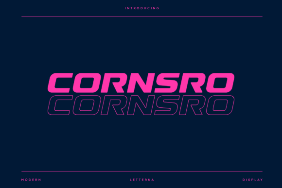
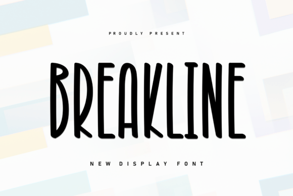
Breakline is a sleek, condensed display face built on verticality. Its letters are tall, narrow, and meticulously balanced—clean lines, even spacing, subtle but unmistakable structure. There’s no flourish or ornament, yet it feels distinctly human: precise without being sterile, modern without leaning into cold minimalism. It’s the kind of font that looks equally at home on a boutique product page and a campaign microsite—because it communicates clarity and intention before a single word is read.
In practice, Breakline thrives where hierarchy matters most: hero section headlines, section dividers, feature cards, and call-to-action buttons. On a coaching website I recently updated, I used it for the main value proposition (“Clarity Starts Here”) above a soft gradient background—and the contrast between its sharp geometry and the organic tone of the imagery created instant visual trust. No extra styling needed. Just Breakline, set large, with generous line height.
How It Performs Across Devices and Contexts
One of my first tests was responsiveness. I dropped Breakline into an H1 at 48px on desktop—and then watched it scale down to 32px on tablet and 28px on mobile. It held up beautifully. The letterforms retain their integrity; no crowding, no awkward gaps. Because it’s designed as a display typeface—not meant for body copy—it avoids the common pitfalls of overly tight condensation at smaller sizes. That said, I wouldn’t drop it below 24px for primary headings on mobile, and never for navigation or form labels. It’s not built for functional UI text—and shouldn’t be asked to be.
I also tested it over image banners (with subtle text shadows and semi-transparent overlays), on dark mode interfaces, and against textured backgrounds. Its strong x-height and open counters kept readability high—even at lower contrast. For accessibility, I paired it with a highly legible, variable-weight sans serif (like Inter or Manrope) for all supporting copy. That combination gave me editorial polish *and* WCAG-compliant contrast without sacrificing personality.
Where Breakline Shines—and Where to Step Back
Breakline excels in short, high-impact roles: shop banner text (“Handmade in Portland”), course title cards (“Foundations of Ceramic Form”), testimonial highlights (“This changed how I see clay”), and even subtle decorative accents like divider lines or icon labels in dashboards (when styled minimally).
It’s less suited for long paragraphs, data-dense tables, or any interface where users need to scan quickly across many similar elements—like admin menus or complex dashboards. Its strength is singular focus, not repetition. And while it supports Latin-based languages well, I double-checked multilingual support before using it on a bilingual client site—confirming it includes extended diacritics and OpenType features like discretionary ligatures (which I used sparingly in logo lockups).
- Great for: Hero headlines, section titles, branded buttons, digital ad banners, portfolio project names, course module headers, blog post titles, email subject lines (in web-safe fallback stacks)
- Less ideal for: Body text, navigation links, form inputs, footnotes, dense comparison tables, or anything requiring rapid scanning at small sizes
Smart Pairing and Practical Delivery
Breakline isn’t a solo act—it’s a lead voice in a thoughtful ensemble. I almost always pair it with a neutral, highly readable sans serif for body copy. For a recent brand kit, I combined it with a warm, slightly rounded sans (like Poppins Light) for paragraph text and captions—creating warmth without compromising clarity. For more editorial sites, a crisp serif like Lora or EB Garamond adds elegant contrast without competing.
On the technical side, I confirmed the font package included WOFF2 files (for fast loading), multiple weights (Light, Regular, Bold—no italics, which is fine given its display role), and clear commercial licensing for client websites and SaaS platforms. No SVG-only delivery, no missing character sets—just clean, production-ready assets. And because it’s a single-family display typeface—not a sprawling superfamily—I didn’t waste time hunting for the “right” weight. Breakline Regular did the heavy lifting, every time.
More Than Typography—A Tone-Setting Tool
What makes Breakline special isn’t just how it looks—it’s how it shifts the tone of an entire page. On a product landing page for a sustainable skincare line, swapping in Breakline for the headline “Pure. Potent. Plant-Based.” added gravitas without stiffness. On a creative agency’s portfolio homepage, it turned “Work” into a statement—not just a menu item. It doesn’t distract. It distills.
If you’re choosing a display typeface for your next digital project, ask yourself: does it reflect the confidence your brand wants to project? Does it elevate—not overwhelm—the content around it? Does it behave predictably across devices and contexts? Breakline answers yes—to all three. It’s not flashy. It’s focused. And in today’s crowded digital landscape, that kind of quiet authority is rare, valuable, and deeply effective.