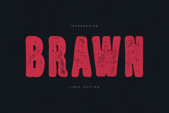
Brawn: A Bold Display Font for Authentic Digital Branding
As a UI designer who ships dozens of landing pages, SaaS dashboards, and e-commerce experiences each year, I don’t reach for display fonts lightly. They’re not background players—they’re tone-setters. That’s why Brawn stands out: it’s a hand-crafted display font built for impact without sacrificing intention. Its raw texture, organic stroke variation, and deliberate imperfections give digital interfaces an unmistakable human signature—something increasingly rare in an era of over-polished, algorithmically smoothed type.
Brawn isn’t designed for paragraphs or navigation menus. It’s made for moments that need to land: hero headlines, product launch banners, course title cards, CTA buttons with attitude, and brand statements that refuse to blend in. Its strong personality comes from visible grain, subtle ink bleed, and uneven baseline alignment—not as flaws, but as intentional design cues that signal authenticity, craftsmanship, and confidence. In practice, that means Brawn performs best at sizes 32px and up on desktop, and 28px+ on mobile—always with generous letter-spacing (at least 0.05em) to preserve legibility across devices.
Where Brawn Adds Real Value in Web Layouts
In hero sections, Brawn instantly establishes hierarchy. Pair it with a clean sans serif like Inter or Manrope for body copy, and the contrast does heavy lifting: users scan the bold headline first, then settle into readable supporting text. On a coaching website’s sales page, “Transform Your Practice” in Brawn—set over a muted gradient—creates immediate emotional resonance before the first bullet point appears. For boutique online stores, Brawn works powerfully on category banners (“Handmade Ceramics”, “Small-Batch Perfume”) where tone matters as much as clarity.
It shines in conversion-focused contexts too—but with nuance. Use Brawn for primary CTAs only when the action aligns with brand voice: “Claim Your Spot”, “Join the Movement”, or “Start Building”. Avoid it for functional microcopy like “Add to Cart” or “Sign In”—those need neutral, fast-reading type. On dark backgrounds, Brawn gains even more presence; its textured weight holds up well against deep charcoals or navy overlays. On light backgrounds, ensure sufficient contrast (at least 4.5:1) by avoiding ultra-thin weights or overly distressed alternates unless used decoratively at large scale.
Readability & Responsiveness: Practical Considerations
Brawn is optimized for display use—not extended reading. Its irregular forms and tactile finish mean it shouldn’t appear below 24px in any responsive context. On mobile, test how it renders inside image overlays: sometimes the texture competes with photo grain, so consider using a simplified alternate (if included) or reducing opacity slightly. Most webfont versions include WOFF2 files for fast loading, and many come with stylistic sets—like cleaner baseline variants or tighter tracking options—for fine-tuning in tight spaces like app headers or dashboard cards.
Check what’s included before licensing: at minimum, you’ll want Regular and Bold weights, basic Latin character support (A–Z, a–z, 0–9, punctuation), and ideally OpenType features like ligatures or contextual alternates. Multilingual support varies—verify coverage for your audience’s language needs (e.g., accented characters for French or Spanish markets). If your project targets global users, confirm whether diacritics are fully implemented before finalizing layouts.
Smart Pairings for Cohesive Digital Identity
The strength of Brawn lies in contrast. Pair it with a highly legible sans serif for UI text, form labels, and paragraph content—Inter, Poppins, or IBM Plex Sans all provide excellent balance. For editorial or premium brand sites (think newsletters, course libraries, or creative agency portfolios), try pairing Brawn with a warm, low-contrast serif like Literata or Cormorant Garamond. The combination signals both authority and approachability—ideal for thought leadership or storytelling-driven layouts.
Avoid pairing Brawn with other decorative fonts—no scripts, no exaggerated serifs, no competing textures. Its personality is strong enough to dominate; supporting type should recede gracefully. In logo design or favicon treatments, use Brawn sparingly: ideal for wordmarks where brand name is short (e.g., “Verve”, “Kairos”, “Stalwart”) and where texture reinforces core values like resilience or artisanal quality.
Licensing, Usage, and Real-World Fit
Brawn is a commercial font—and that matters. If you’re building templates for clients, selling digital products on Gumroad, or running a Shopify store with branded assets, ensure your license covers web embedding, unlimited pageviews, and redistribution rights where needed. Some licenses restrict use in SaaS apps or white-labeled dashboards, so always review terms before integrating into production code. For freelance designers, a standard desktop + web license usually covers client websites and landing pages—but verify whether app screens or email templates fall under the same scope.
Think of Brawn as a strategic design asset—not just decoration. It communicates before a single word is read. A fitness app using Brawn for its “30-Day Challenge” banner feels grounded and real, not stock-photo generic. A climate tech startup using it for “Build Resilience” on their homepage signals urgency and action—not abstraction. Even in minimalist layouts, Brawn adds dimension: one bold line, ample whitespace, and a purposeful sans serif counterpoint create rhythm that guides attention without shouting.
Ultimately, Brawn earns its place in your font stack when authenticity drives your brand strategy—not trend-chasing. It doesn’t try to be everything. It’s unapologetically display-first, texture-forward, and human-scaled. And in a digital landscape saturated with frictionless, forgettable type, that kind of focused intention is exactly what makes a layout memorable, trustworthy, and worth clicking.