Arena Clash: A Designer’s Real-World Type Audit
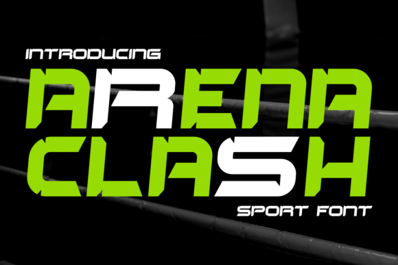
First glance at Arena Clash lands like a well-timed drum hit—bold, deliberate, and charged with presence. It’s not playful. It’s not delicate. It’s a display font that leans into controlled intensity: sharp terminals, tight letterfit, and a subtle architectural tension in the curves. The uppercase feels like carved stone; the lowercase (where it exists in the family) adds grounded contrast without softening the stance. This isn’t a font that whispers—it asserts. And that changes everything about how and where you deploy it.
Where Arena Clash Earns Its Place—Not Just Its Space
In logo design, Arena Clash excels when the brand needs immediate visual authority—think athletic apparel, esports studios, premium supplement lines, or boutique fitness studios. Its rhythm works best in short, high-impact names: two to four words max. Try “VOLT”, “KAIROS”, or “IRON VAULT” in all-caps Arena Clash on matte black packaging—it reads as intentional, not aggressive. That distinction matters. It’s confident without shouting, refined without fading.
For packaging design and product labels, Arena Clash holds up exceptionally well on textured substrates and foil-stamped surfaces. Its stroke contrast is moderate—not so extreme that fine details vanish in embossing or screen printing. I’ve used it successfully on rigid box lids, ceramic mug decals, and vinyl sticker sheets. But here’s the caveat: avoid using it below 16pt in print or 24px on screen for body-like context. It’s not built for paragraph flow—it’s built for declaration.
In editorial design and social media graphics, Arena Clash shines as a headline anchor. Paired with a clean sans serif (like Inter or Helvetica Now) for body text, it creates hierarchy that feels earned—not imposed. On Instagram carousels or Pinterest pins, it grabs attention in under 0.8 seconds, especially against muted or gradient backgrounds. For digital ads, its strong silhouette scales cleanly—even at thumbnail size—making it reliable for retargeting banners where recognition trumps ornamentation.
Where It Steps Back—And Why That’s Smart
Arena Clash is not your go-to for invitations unless you’re designing for a boxing gala or a cyberpunk film premiere. It lacks the warmth of a script font or the approachability of a rounded sans. Similarly, avoid it in UI buttons, navigation menus, or anywhere users need to scan quickly for function—not feeling. It’s also overkill in blog graphics that prioritize clarity over character (e.g., step-by-step tutorials or data explainers).
This is a premium font that thrives in scarcity. Use it for one dominant element per layout: a hero headline, a logo lockup, a quote pull, or a merch tagline. Let it breathe. Don’t stack it with another display font—that’s visual noise, not harmony. And never force it into long-form web design headers with dynamic text resizing; its tight spacing can collapse unpredictably across viewports without custom CSS adjustments.
What It Does to Your Brand—Beyond Aesthetics
Using Arena Clash signals intentionality. It tells your audience you’ve chosen strength over trend-chasing, precision over padding. That builds trust—especially with audiences who value craftsmanship: makers, collectors, fitness professionals, indie game devs. It reinforces brand consistency when applied rigorously: same weight, same case treatment, same spacing logic across all touchpoints.
But be mindful of mood alignment. If your brand voice is empathetic, nurturing, or whimsical, Arena Clash will misfire—not because it’s “bad,” but because typography is emotional shorthand. Pair it with a warm serif (like Tiempos Headline) for contrast in editorial layouts, or let it stand alone over monochrome photography for maximum gravitas.
Practical Designer Notes—Test Before You Trust
- Always test Arena Clash in black and white first—its impact relies on contrast, not color tricks.
- Check small-size readability on actual mockups: print a 12pt label, view a 20px web header on mobile, hold a Cricut-cut vinyl sample at arm’s length.
- Compare uppercase vs. lowercase usage—some weights include both, but the lowercase has less presence. Stick to all-caps for branding applications unless the design demands deliberate tonal shift.
- Review spacing manually. Kerning pairs like “AV”, “To”, and “We” often need slight adjustment in logo work—don’t rely solely on default metrics.
- Test font pairing early: set a paragraph in a neutral sans serif, overlay a headline in Arena Clash, then swap in a serif, a script, and a handwritten font. See where the energy balances—and where it fights.
- Confirm commercial licensing before any client deliverable or digital product upload. As a display font, its license typically covers web embedding, app UI, and unlimited impressions—but verify if you’re bundling it into Canva templates or selling printable design files.
Final Verdict: Precision Over Personality
Arena Clash isn’t about being likable. It’s about being unforgettable in the right context. It’s the kind of display font that earns repeat use—not because it’s versatile, but because it’s uncompromisingly effective where it belongs. For designers building brand identity systems, marketers launching bold campaigns, or crafters developing premium digital products, it’s a reliable tool when deployed with discipline.
It won’t solve weak concept work. But in the hands of someone who understands hierarchy, restraint, and audience alignment? Arena Clash becomes more than type—it becomes tone, texture, and testimony.